Loading image...

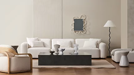
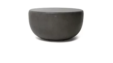
Move 65 Coffee Table
You walk into the living room and your eye lands on the coffee table. It's not bare. There's a book, a candle, maybe a small dish that started life as something else. Nothing is wrong, exactly. But nothing is finished either. The surface reads as occupied, not composed, and you've stopped noticing it the way you stopped noticing the light switches.
Now imagine the same table styled by someone who does this for a living. The objects are familiar, more or less the same things you already own, but they sit in relationship to each other. There's height. There's space. There's a single living stem that signals the room is loved. The table has stopped being furniture and started being a quiet centrepiece of the room.
The gap between those two surfaces is not budget, taste, or access to a stylist. It is a framework, and the framework is teachable. This guide walks through the rules designers actually use, the small flexes that distinguish a styled table from a stocked one, and the way the rules subtly change once you're working with a stain-resistant concrete top that doesn't need to be protected from real life.
Loading image...
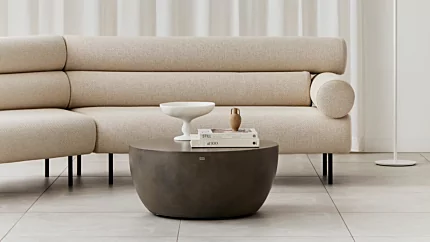
Move 65 Coffee Table
Most styling guides reach for the rule of three. It's a useful entry point and not quite enough. A coffee table reads as designed when five elements are present together, each doing a specific job in the composition.
Anchor. A low base object that grounds the arrangement and gives the eye somewhere to start. Usually a stack of books, sometimes a tray.
Vertical. At least one element that creates height. A vase, a slim candlestick, a sculptural vessel, a single tall stem.
Organic. Something living or once-living. Fresh flowers, a leafy branch, a potted plant, a dried botanical, a piece of driftwood.
Texture contrast. Two or more surface qualities playing against each other. Smooth glazed ceramic next to woven natural fibre. Matte stone next to glossy glass. Linen-bound book next to brushed brass.
Breathing room. Deliberate negative space, roughly a third to half of the table surface left clear, so the eye can rest.
The reason these five work together rather than as a checklist is that each one solves a different visual problem. The anchor stops the composition from feeling weightless. The vertical lifts it. The organic element keeps the table from looking museum-cold. The textures give the eye reasons to keep looking. The breathing room is what separates editing from cluttering. Pull any one of them out and the surface starts to drift back toward stocked.
These elements work on any surface, but a stain-resistant top changes which objects in each category are actually viable. We'll get to that.
Loading image...

Circ 40 Coffee Table
The anchor is the foundation of the vignette, and nine times out of ten, it's a stack of coffee table books. Books work because they have weight, scale, and a soft visual edge that other anchors don't. They lower the centre of gravity of the composition and give every other object a base to relate to.
A few stacking principles that quietly do most of the work. Two to four books is plenty. Largest at the base, descending in size as you go up. Mix horizontal stacks (which act as platforms for smaller objects) with the occasional vertical stand. And remove the dust jackets. Underneath the printed sleeve, most monographs and design books carry a beautifully muted linen or cloth binding in a neutral spine, which sits in a styled composition far better than a glossy publisher graphic.
The book-as-pedestal technique is worth knowing. A single horizontal book, or a stack of two, becomes a low plinth for whatever sits on top. A small ceramic bowl gains presence the moment you set it on a book; a candle reads more deliberate. It's the difference between an object placed on a table and an object placed in a composition.
Trays do a different job. They corral. A flat-bottomed tray draws a frame around a smaller group of objects, hides the inevitable remote control, and gives the eye a clear boundary to read the vignette inside. Pick a tray whose colour or material harmonises with the table; matched wood or stone trays risk disappearing into the surface, but a tray in a contrasting tone (brass on a pale concrete, leather on a darker one) lifts the whole grouping.
There's a credible alternative view. Stylist Colin King has argued against the tray habit, preferring small wooden boxes or unframed groupings. He's right that a tray can become a crutch, a way of staging objects that should sit confidently on the surface in their own right. Treat trays as a tool, not a default.
A note on books one designer-styled coffee tables make consistently. The books on display should be books you actually open. Reference monographs, hardback fiction, exhibition catalogues, a regional design title. Their job is double duty: they style the table, and they tell a quiet story about whose house this is.
When the table is made from a uniformly toned material rather than a busy grain or veined stone, the anchor sits more easily. Our concrete coffee tables collection offers three neutral colourways that act as a calm backdrop, so a book stack reads as deliberate composition rather than competing with the surface beneath it.
Loading image...

The eye reads a coffee table from the side first, not the top, which is why height variation matters more than the number of objects. A flat composition, no matter how thoughtful the selection, reads as inventory. A composition with at least one strong vertical reads as design.
Think of it as a three-tier system. A low base layer: books and tray, sitting on the table. A medium accent: a low bowl, a small sculpture, a votive or low pillar candle, something between roughly 80 and 200 mm tall. And a single tall element: a slim vessel, a branch in a vase, a sculptural piece that draws the eye up to roughly twice the height of the medium accent.
Choosing the tall element is the move most worth slowing down for. Scale it against the room, not just the table. A vase that looks right in your hand can disappear in a six-metre living room and dominate a small lounge. A useful test: hold the vertical element where you intend to place it and step back to the doorway. If you can see it from there as a deliberate silhouette against the wall behind, the scale is working.
The vase or sculptural vessel is the most flexible vertical option, partly because it can hold the organic element as well, one object doing two jobs. Candlesticks and slim taper holders are the simplest medium accent. And in the evening, the flame on a lit candle quietly becomes the vertical itself, which is why even very pared-back compositions often include a single low candle that does nothing during the day and a great deal at night.
The height of the table itself sets the proportions. Lower tables, the kind that sit at sofa-seat height or just below, push styled objects taller in proportion to the surface, so the vase has to work harder. Taller, more sculptural tables already carry visual presence, so styled objects can be denser and shorter without the composition feeling lost. A vignette designed for a low round table won't translate to a tall cube without rescaling. The framework stays the same; the dimensions shift.
Loading image...

A composition without an organic element reads as an arrangement. A composition with one reads as a room. The difference is small and significant: living and once-living objects bring a different rhythm of decay, growth, and seasonal change into a setting that's otherwise built from finished, static materials.
Options arrange themselves along a maintenance axis. Fresh-cut flowers carry the highest visual reward and the shortest life; most arrangements need refreshing weekly, and water needs replacing every few days. A single leafy branch in a tall vessel is one of the great designer shortcuts: eucalyptus, olive, magnolia, or a flowering quince stem can hold for two to three weeks and reads as deliberate restraint rather than minimalism. Living potted plants, especially a small trailing pothos or a young monstera, run for years with light maintenance. Dried botanicals (pampas, wheat, dried hydrangea, preserved eucalyptus) ask nothing and last indefinitely. A piece of driftwood or a decorative log makes a permanent architectural anchor.
Scale the organic element to the vertical: a single stem or branch roughly two-thirds the height of the tallest vessel reads as proportionate, where a stem that fully matches the vessel competes with it.
A trailing pothos, a small monstera deliciosa, or a single stem of eucalyptus or olive in a tall slim vessel. These three options cover the range from low-maintenance living foliage to a long-life cut stem. All three sit comfortably at coffee-table height without growing into the rest of the composition.
Living styling has a styling tax: drip trays under pots, watermarks under vases, the occasional fallen petal. On porous surfaces (softwood, certain marbles, untreated stone), that tax is real, and it's the reason a lot of beautifully styled magazine photos quietly include a piece of cardboard you can't see in the shot. On a stain-resistant concrete top, the tax disappears. Fresh-cut stems can sit in a vase that doesn't need a coaster underneath. A potted herb or plant can live directly on the surface, soil and watering included, with no protective base. The styling implication is that the organic element reads cleaner, because there's no second object whose only job is to protect the table from the first object.
Colour is the easy lever and the wrong one to pull first. A coffee table styled around a colour palette can still read flat. A coffee table styled around two or three contrasting textures reads layered, even if the palette is almost monochrome.
Texture contrast works because each surface reflects light differently, and the eye perceives that difference even before it registers the object. A smooth glazed ceramic bowl next to a coarse woven basket creates an instant sense of depth. A matte stone sculpture next to a glossy glass vessel does the same. A linen-bound book next to brushed brass, leather-bound spine next to fresh foliage, soft folded throw next to hard ceramic. The principle is simple: at least two surface qualities should be in conversation with each other, ideally on adjacent objects so the contrast is read at a glance.
Three is the upper limit. Beyond three textures the composition starts to read as a sample shelf rather than a vignette, with each surface fighting for attention. If the table has a tray, a book, a vase, a candle, a bowl, and a stem, those six objects shouldn't represent six distinct materials. Two or three textures, repeated across the objects, is the sweet spot.
The often-overlooked element here is the surface of the table itself. Designers treat the tabletop as one of the textures in the composition, not as a neutral backdrop. A polished marble top reads as a texture. A woven rattan top reads as a texture. Concrete reads as a texture: slightly tactile, matte, with the depth that comes from a material that has actual mass. Once you start to think of the surface as a participant rather than a stage, the choice of what sits on it becomes more deliberate. Softer or shinier finishes (linen, brass, glass) play well off a matte concrete top; very matte objects (unglazed pottery, raw wood) work harder against the same surface and need a glossy or metallic element to keep the contrast alive.
The two-thirds rule is the closest thing to a hard rule in coffee table styling. Objects should occupy roughly two-thirds of the surface, leaving one-third clear, and at least one corner or edge should be fully open. The reason has nothing to do with arithmetic and everything to do with how the eye reads composition. A fully covered surface reads as cluttered no matter how beautiful each individual object is. A surface with a clear corner reads as composed and inviting, with somewhere to set a glass of wine.
Scale the objects to the table, not to themselves. A tall vase that looks slim on a Move-scale rectangular table reads as oversized on a compact round. A modest book stack that anchors a small round looks lonely on an oversized rectangle. As the table grows, the styling has to either grow with it or break into multiple distinct groupings (more on that in the shape section).
There's also the relationship between the table and the seating around it. A clearance gap of roughly 350 to 460 mm [14 to 18 in] between the table edge and the sofa is the standard that most interior designers work to, which gives enough room to walk around without separating the table from the seating zone. It's worth measuring; a table positioned closer than that starts to read as cramped, and a table positioned further away stops feeling part of the seating arrangement.
Negative space is the element styling guides oversell as a concept and underdeliver as a number. A practical version: imagine dropping a hand on the table to set down a coffee cup, a book, a phone. If there isn't a clear zone of roughly 200 mm where you could do that without moving styling first, the surface is overstyled. The breathing room isn't decoration. It's the part of the composition that signals the table is still a table.
Most styling advice assumes a rectangular table by default. Other shapes need different arrangements, and the difference is mechanical rather than aesthetic.
Loading image...

Round shapes resist rectangular tray-based arrangements. The instinct is to centre everything, which produces a wreath effect. The better approach is asymmetric: a single tall vertical positioned roughly two-thirds across, balanced by a low spread of books and a small object on the opposite side. A curved edge wants curved groupings, so a low ceramic bowl tends to sit more naturally than a square tray. Round tables also reward a single strong organic element, a tall stem of eucalyptus or a low branch in a sculptural vessel, because the curve frames the silhouette.
Loading image...


Square tables give two clean options. The first is a centred grouping with concentric layers: anchor in the middle, vertical rising from it, organic spilling slightly off the centre line. The second is a four-zone division: a tray in one quadrant holding two or three small objects, a vase in the opposite quadrant, a clear quadrant, and a small accent in the fourth. The second approach is more advanced and harder to get wrong, because the empty quadrant carries the breathing room without you having to manufacture it.
Loading image...

Rectangular shapes invite a two-vignette approach. One styled zone (the anchor, the vertical, the organic) sits at one end, and the other end is either clear or lightly styled with a single low object: a stack of books, a single candle, a small dish. The eye reads the loaded end as the focal point and the lighter end as the breathing room. The alternative is a three-zone approach across the length: anchor at one end, accent in the middle, vertical and organic at the other end, with breathing space between each grouping.
Tables over 1.5 metres in length stop working as a single composition. At that scale, a centred vignette leaves the table looking empty, and a long single arrangement reads as a row. The designer move is to treat the surface as a small landscape with two or three distinct compositions spaced along the length. Each one is a complete vignette in its own right, sharing a colour or material palette so they read as related. Imagine three small islands on the same map.
Mapping the shape-by-shape principles to actual table styles is straightforward in our coffee tables collection, where the silhouette itself supplies most of the composition.
A small but increasingly common feature in modern coffee table design is the integrated lower shelf, which adds a second styling zone and a small amount of usable storage without the visual weight of a closed cabinet. The two-tier construction creates a styling problem most guides don't address.
The principle for the lower shelf is recessive. The shelf should read as quieter than the top: lower object density, fewer textures, more horizontal lines than vertical ones. Vertical objects on the shelf get cropped by the top of the table, which means a vase or candlestick almost never works there. Horizontal objects do: stacked books on their side, a folded throw, a flat woven basket holding magazines, a piece of dried wood or a decorative log laid lengthways, a small framed artwork leaned against the back of the shelf.
The goal phrase is stored with intention. The shelf shouldn't look displayed in the way the top is displayed. It should look like the things on it have been chosen, but the choice was about utility rather than show. A folded throw on the shelf reads as ready-to-grab on a cool evening. A stack of magazines reads as still-being-read. A basket reads as holding something. The visual relationship to the top is best described as an echo rather than a repeat: a colour or material thread (the same warm wood, the same linen-bound spine, the same brass note) ties the two zones together without copying the top arrangement on the bottom.
Stack books horizontally, add a folded throw or a low woven basket, and lean a single small artwork against the back. Keep the shelf less dense than the top, with more horizontal lines than vertical. The goal is stored with intention, not displayed.
When a table is built with a waterfall edge and a recessed shelf integrated into the original casting, the shelf reads as part of the architecture rather than a bolted-on platform. The Niche 50 coffee table is one of the few models that carry an integrated lower shelf in seamless concrete construction, which gives the shelf the same uniform tone and matte tactility as the top. The styling implication is that the shelf doesn't need to compete with itself; the concrete carries the surface, and the objects need only carry the composition.
Loading image...

Most styling guides are written for surfaces that need to be protected from real life. Wooden tops watermark. Marble stains. Soft stones and certain woods scratch easily. Most of the styling advice you'll read elsewhere quietly assumes those constraints: coasters under glasses, drip trays under plants, candles only in holders.
A stain-resistant concrete top changes four specific rules.
No coasters required. Fluid Concrete resists rings from wine, coffee, water, and condensation. A glass can sit directly on the surface without leaving a watermark. Coasters become a styling choice (a small leather coaster as a colour accent, say), not a functional necessity.
No drip trays under plants and flowers. A vase of fresh-cut stems with water in it can sit directly on the surface. A potted herb in damp soil can live on the table. The organic element reads cleaner because there's no protective layer underneath it doing visual work that has nothing to do with the composition.
Candles directly on the surface. Concrete is naturally fire-resistant due to its non-combustible composition, and the dense Fluid Concrete casting handles direct heat from a pillar candle, taper, or low votive without a separate holder underneath. The candle sits on the table the way it sits in the photograph (no saucer, no plate, no glass dish), which is usually how it was designed to look in the first place.
No fear of real life. The styling can accommodate a cup of coffee with a damp base, a glass of wine, a watering can, a single open book with morning toast crumbs near it. The styling doesn't have to be defended from the room.
That has a knock-on effect on object choice. On surfaces that need protecting, designers often gravitate toward the safest, most static objects: closed vessels, dry materials, decorative-only items. On a surface that doesn't need protecting, the styling can move toward the things that actually make a room feel lived in: a glass with water still in it from the morning, a notebook left open, an espresso cup beside a small dish.
The three concrete colourways shape the palette around them. A Natural (cool warm grey) tabletop pairs naturally with warm woods, brass, terracotta, and sage. A Graphite (deep charcoal) tabletop reads beautifully with cream, brass, copper, deep greens, and the dark stems of certain dried botanicals. A Bone (soft warm white) tabletop sits well with linen, oak, dried grasses, soft pastels, and blackened steel. None of these are rules. They're starting points, and the styling moves outward from there.
Not on a stain-resistant concrete coffee table. Fluid Concrete resists rings from wine, coffee, water, and condensation, which means coasters become a styling choice rather than a functional necessity. If you want a small leather or stone coaster for the colour or texture it brings to the composition, that's a design call rather than a protective one.
Loading image...

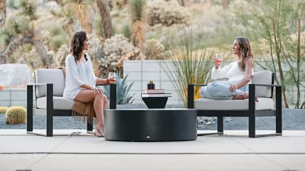
Every styling guide assumes a living room. The covered terrace, the alfresco lounge, the poolside seating area are styled fewer times because the surface usually isn't built for it. A coffee table rated for outdoor use changes that calculation.
Indoor–outdoor styling continuity is the first move. Choose styling objects that travel between settings without rethinking: heavier ceramics, dried botanicals, stones, weather-tolerant vessels. Soft elements rotate by setting: books, fresh-cut flowers, and unsealed candles stay indoors; weighted vessels of olive branches, beeswax pillar candles, low concrete planters, and ceramic bowls move outdoors. The same composition framework (anchor, vertical, organic, texture contrast, breathing room) applies in both rooms.
A few outdoor-specific considerations worth knowing. Wind is real. Lightweight objects that look right in a sheltered indoor lounge will travel across the deck on a windy afternoon, so weighted ceramics, low-centred-of-gravity vessels, and books too heavy to lift in the wind are better outdoor choices. UV breaks down fabric and paper, so a styling that's beautiful indoors will fade outdoors in months. Dried botanicals, ceramics, stone, glass, and weatherproof finishes handle the sun. Rain handles itself for the right materials: a potted plant in a concrete planter shrugs off a tropical downpour; a paperback book doesn't.
The styled outdoor coffee table on a covered terrace might run something like this. A weighted ceramic vessel at one end holding olive or eucalyptus branches. A low tray (heavier than its indoor equivalent) with two beeswax pillar candles and a small stone object. A clear central zone for setting down a glass. At the other end, a sculptural piece of driftwood or a low concrete planter with succulents. That composition holds through a season and only needs the organic element refreshing a few times.
Our outdoor-rated coffee tables carry an all-season cover for every model, which lets a styling stay in place under cover rather than being broken down at the end of summer. A small detail with outsized impact: the styling stops being a seasonal job and starts being a permanent feature of the terrace.
Loading image...

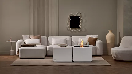
A concrete coffee table makes a natural anchor for a fire feature, because the surface can sit close to flame without needing protection. There are three common arrangements: a small ethanol burner placed directly on the surface, an integrated fire-table cluster in which the coffee table pairs with a sidecar-scale fire table, and a freestanding fire pit on the terrace with the coffee table styled around it.
The modular pairing is the cleanest arrangement. A compact cube-scale coffee table holds the styling (books, vase, sculptural object) and a separate Sidecar 24 fire table sits beside it, holding only the flame. The styling lives on one surface, the fire on the other, and the eye reads them as a single cluster. It's the kind of arrangement that solves the practical problem of where to put a drink while still keeping the styling away from heat.
When the flame is present, the composition shifts. Allow clearance of roughly 200 to 300 mm around the flame's heat halo, beyond which styling objects can sit comfortably. Fire-safe materials (ceramic, stone, concrete, glass) handle the proximity. Soft materials (linen napkins, paperback books, dried botanicals, candles in wax form) need to sit beyond the halo or move elsewhere. The simplest rule: if you wouldn't hold the object in your hand near the flame for a few seconds, don't style it that close.
The flame itself takes over as the vertical and organic element in the composition. It moves, it changes height with the breeze, it carries the seasonal-rhythm-of-decay-and-growth role the way a fresh-cut stem does indoors. Surrounding styling should support the flame, not compete with it. Two or three quiet objects on the coffee table, the fire as the focal point on the sidecar, and a clear zone between the two reads as a complete composition.
The framework stays the same across the year. The objects rotate.
In spring, the palette lightens. Lighter linen-bound books, fresh-cut tulips or magnolia branches, glass and pale ceramic, a low pastel candle. The composition feels more open and slightly less dense.
In summer, the styling often moves outdoors with the rest of the entertaining. Olive branches in a weighted vessel, citrus on a tray, low candles for evening, weighted ceramics that handle the sea breeze.
In autumn, the palette warms. Dried botanicals (eucalyptus, wheat, pampas) take over from cut stems, brass and copper come into the surface mix, beeswax pillar candles burn longer, a decorative log or two on the lower shelf signals the season change.
In winter, the composition tightens. Evergreen sprigs, taller candles, books with darker spines, a folded wool throw on the lower shelf, more density and less negative space because the eye wants more warmth in the visual field.
A practical cadence: one swap per month keeps the table from settling into invisibility. The structural layer (books, tray, sculptural vessel) stays for months at a time. The organic layer refreshes weekly to fortnightly. A full restyle, four times a year, marks the season change.
Two or three permanent objects across the seasons act as the anchor of continuity. A signature ceramic, a sculptural vessel, a favourite book whose spine you don't mind seeing every day. Those don't move. Everything around them does.
A short field guide to the mistakes that surface most often, and the small adjustments that fix them.
Everything the same height. The composition reads as inventory. Add one vertical at least twice the height of the next-tallest object.
No clear space. The surface reads as cluttered no matter how beautiful each piece is. Remove the smallest two objects and leave a corner open.
Matching set syndrome. Two vases from the same range, two candles from the same set, the matching tray from the gift shop. Replace one matched object with something asymmetric: a found stone, a single book, a piece of dried wood.
Books with dust jackets on. The glossy printed sleeve was designed for a bookshop shelf, not a styled composition. Remove the jackets; the cloth or linen binding underneath is almost always more beautiful.
The fake plant problem. A single living stem or a single dried botanical beats five artificial plants. If living is impossible, lean fully into dried, where the artifice is honest.
Styling that fights the table surface. The most common designer-level mistake. A busy grain or a heavily veined stone wants different objects than a uniform concrete or a clean lacquered wood. Acknowledge the surface as one of the design elements, and choose objects that work with it.
The last one is the most interesting because it's the one most styling guides skip. The surface beneath the styling is the surface above the floor, and it carries as much visual weight as anything you place on it. Treat the table itself as the first object in the composition.
Three vignettes, fully realised, so the framework lands in concrete terms.
The minimalist round. A compact round table, Bone colourway, in a quiet living room. Three objects total. A stack of two linen-bound books toward one side. A low brass bowl resting on the top book. A single tall stem of eucalyptus in a slim vessel on the opposite side, balancing the composition asymmetrically. Roughly two-thirds of the surface is clear. The whole arrangement reads at a glance and breathes.
The architectural rectangular with shelf. A rectangular two-tier table, Graphite colourway, in a darker, more layered living room. On the top: a stack of three leather-bound books at one end, a tall sculptural ceramic vessel rising from it, a low pillar candle beside the stack, a small folded throw at the opposite end. The composition concentrates at one end and breathes at the other. On the lower shelf: three books laid horizontally, a flat woven basket holding magazines, a small framed black-and-white print leaned against the back of the shelf. The two zones echo through the brass note in the top vessel and the brass clip on the basket, but they don't mirror each other.
The outdoor terrace. An oversized rectangular outdoor coffee table on a covered alfresco, Natural colourway. Three vignettes spaced along the length. At one end, a weighted ceramic vessel holding three or four olive branches and a low tray with two beeswax pillar candles. In the middle, a stack of three design books and a single piece of weathered driftwood. At the other end, a low concrete planter holding three succulents. Clear zones between each grouping. The composition reads as three small islands rather than a single line.
Our full designer coffee tables collection is the starting point for picking the silhouette that suits the composition you want to build.
Five to seven discrete objects, grouped into two or three vignettes, occupying roughly two-thirds of the surface. Fewer than five tends to read as sparse on most coffee tables; more than seven starts to read as cluttered. Group them so the eye reads compositions rather than a count.
Use a horizontal book stack as the visual anchor in place of a tray. Group objects directly on the surface in a tight vignette so they read as a composition rather than scattered items. The surface itself becomes the unifier, which works best on a clean, consistent material like concrete where the tabletop is already doing visual work.
Yes. Fluid Concrete is naturally heat-tolerant and fire-resistant, so a pillar candle, taper, or low votive can sit directly on the surface without a separate tray or holder. The candle reads as part of the composition rather than as an object on a saucer.
The structural layer (books, tray, sculptural vessel) stays for months at a time. The organic layer (fresh flowers, branches, potted plants) refreshes weekly to fortnightly. A full restyle is seasonal, four times a year. Monthly small swaps keep the table from settling into visual invisibility between full resets.
The best-styled coffee tables look like they were almost not styled. The framework is there (anchor, vertical, organic, texture, breathing room), but the hand of the stylist is invisible. The composition reads as the natural state of the room, not as an arrangement that was assembled before a guest arrived and dismantled after they left.
That kind of styling depends on something most guides quietly overlook: permission. The willingness to put a real glass of wine down on the surface, to leave a book open mid-chapter, to let a vase of cut stems shed a petal without rushing for the cloth. A surface that can absorb real life without showing it gives the styling room to feel inhabited rather than staged, which is the thing that distinguishes a designed room from a photographed one.
Five elements, three colourways, two-thirds covered, one-third clear. The numbers are simple. What they leave space for is the part that matters.